Mansura
Chowdhury
Designer
Portfolio
- AMSS Application
- Avestia Publishing
- Spoil Alert
- Pet Circus
- Battle of the Bands
- Canterbury Soccer Club
- Book It
- Rowan Atkins Applications
- Nitor Carpentry
- Emma Watson Magazine Spread
- DPS Original
- Artist Study
- Stevie Wonder Poster
- Conference Website Templates
AMSS Application
AMSS (Avestia Manuscript Submission System) is a article submission system created for Avestia Publishing.
The goal of this project was to redesign the web application to follow the brand and make it more user friendly. The project was created along with a programmer who developed the application, while I designed the front-end.
WebsiteConference Website Template
Designed and developed a conference website template that is currently being used for over 20 conference websites. I wanted to ensure that the focus is on the paper submissions, important deadlines and the registrations, which is why those are the first links that you see when you visit the websites. You can find a list of the conferences that are using this template here: list of conferences.
WebsiteAvestia Publishing
Avestia Publishing is a fast growing academic publication platform for professors, researchers, students, and the public sector. We are based in Canada and have offices world-wide. All Avestia publications are peer reviewed and maintain high standards, both technically and professionally. Most of our publications are based on the Open Access model. The International Academy of Science, Engineering, and Technology (International ASET Inc.) is our parent institution.
The goal of this project was to redesign and develop their website under a consistent brand. We wanted the website to communicate what Avestia was all about, which is that it is a publishing company where researchers and students can share their ideas on topics ranging from science to technology. We wanted to pull the users' attention to the list of journals and the scientifc articles that were recently published.
In order to ensure that the brand is consistent, we have also redesigned their individual journals websites as well. The individual journal websites were designed following the same theme but still ensuring that they each had their own unique attractions.
Avestia Publishing Website Journal WebsiteSpoil Alert
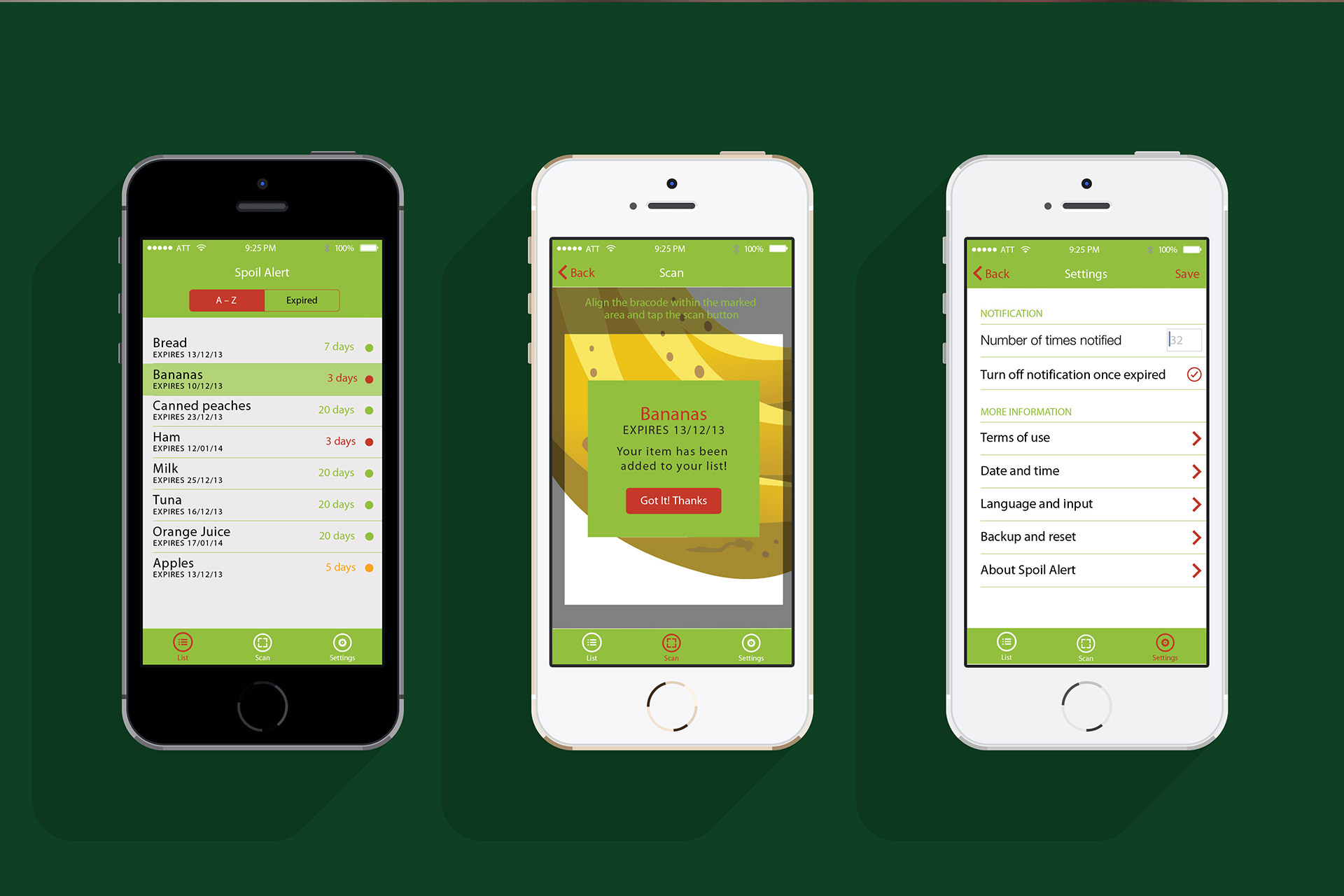
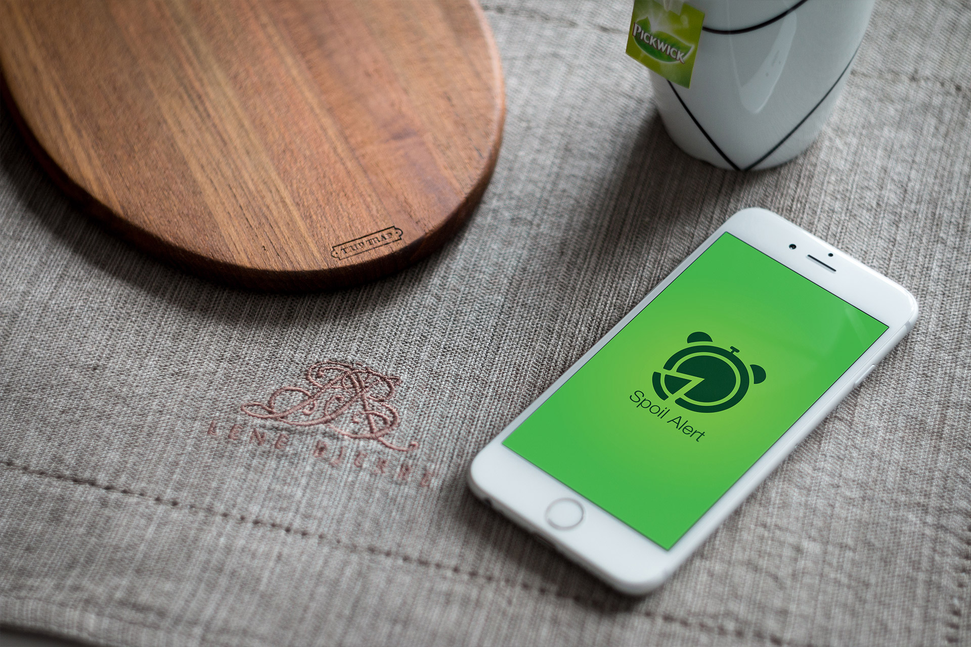
Are you too busy to keep track of your food? Or do you come home and see that your food is all of a sudden expired? Well, it is your lucky day because Spoil Alert will help you keep track of your food for you! You do not have to worry about reminding yourself anymore or coming home and being surprised with expired goods!
The idea is for you to scan your groceries in the application and it will collect the name of the product and their expiration date. You can specify in the settings of the applications in terms of how often you want to be reminded and the application will also give you some suggestions in terms of what you can make with your product.
Canterbury Soccer Club
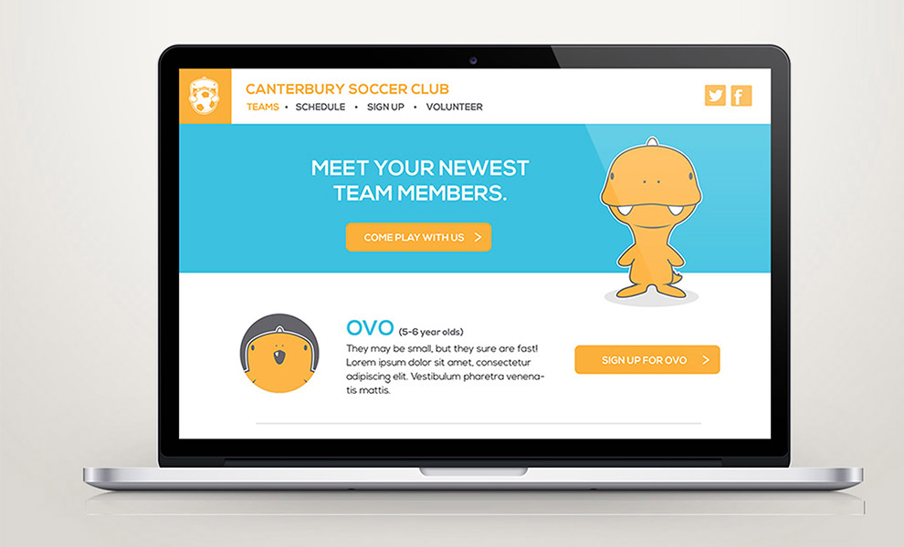
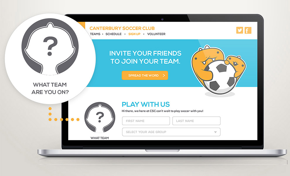
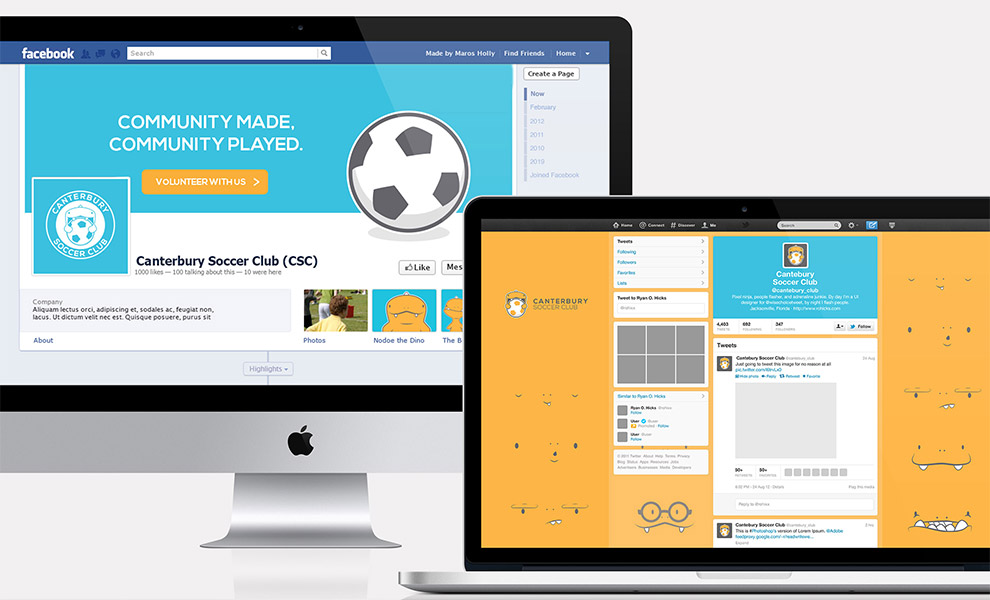
The Canterbury Soccer Club has been operating in Ottawa, Canada for almost 40 years to provide non competitive recreational soccer to youth between the ages of 5 and 15 years old in the Canterbury and Alta Vista community of Ottawa. The club's goal is to ensure that our youth HAVE FUN while all getting an equal opportunity to play the game.
The goal of this project was to rebrand Canterbury Soccer Club in a way that would gather more interest from children. My team and I came up with a similar method from getting inspiration through video games. We created different team icons and names based on the age groups and when the children "graduated" from one team to the other, they will feel like they have leveled up! It is both exciting and rewarding! I was personally in charge of creating the website along with one other member.
Website PresentationNitor Carpentry
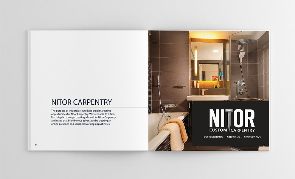
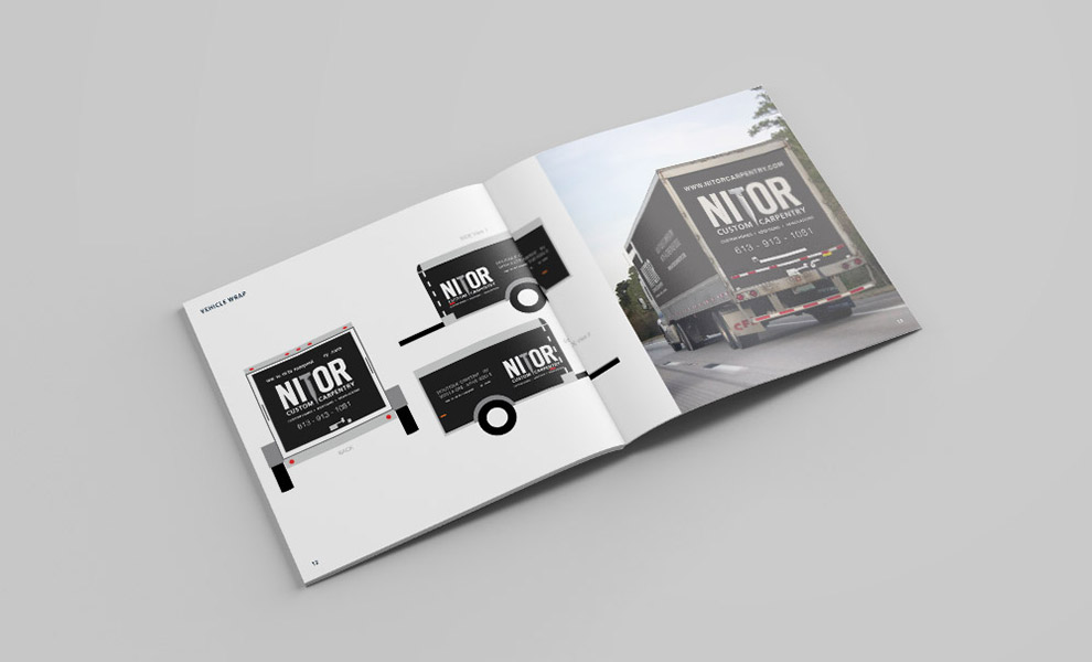
At Nitor, we build to last and we stand by our quality work. All our projects come with a premium 3-year warranty – although we doubt you’ll need it.
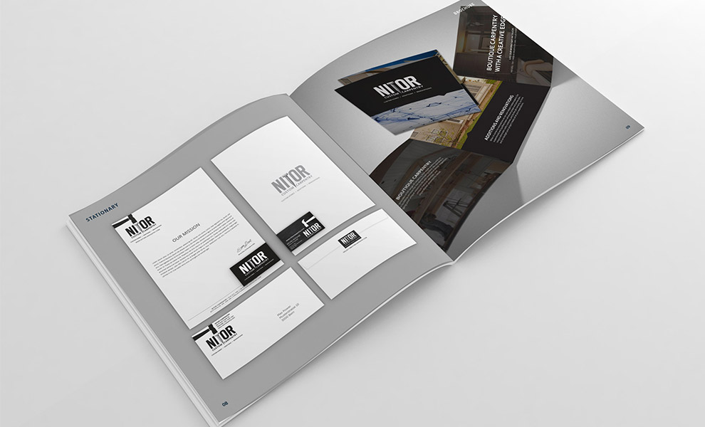
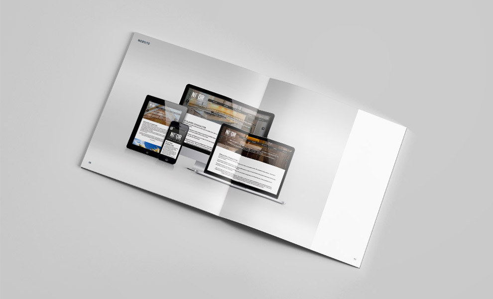
The goal of this project was to strenghten the company brand by having a strong online presence for marketing purposes. In order to acheive this, I created their website and marketing materials, such as, stationary, brochure, and vehicle wraps.
WebsiteDPS Original
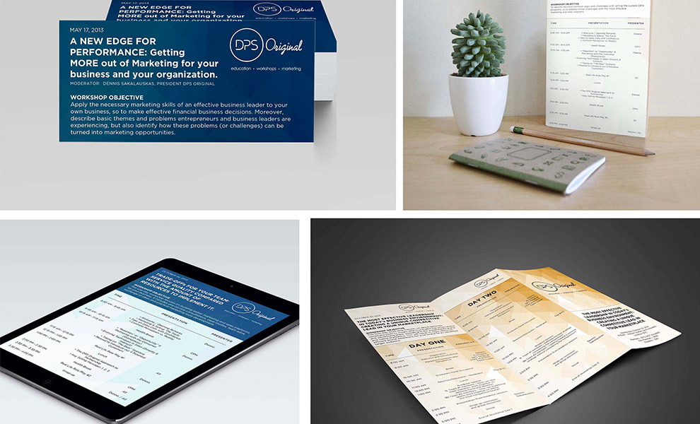
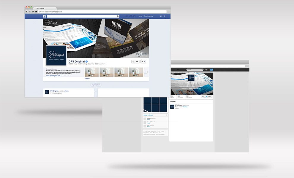
At DPS Original Healthcare and DPS Marketing & Design, our passion is medical education, strategic marketing and creative branding, exhibits, and workshops & training. Our 15 years of experience partnering with major companies and innovative organizations, goes beyond the traditional and expected, delivering the most effective, strategic and practical solutions.
The goal of this project was to rebrand DPS Original using simplicity and professionalism. We then made the brand stronger through marketing materials, such as brochures, booklet, and social media.
Book It
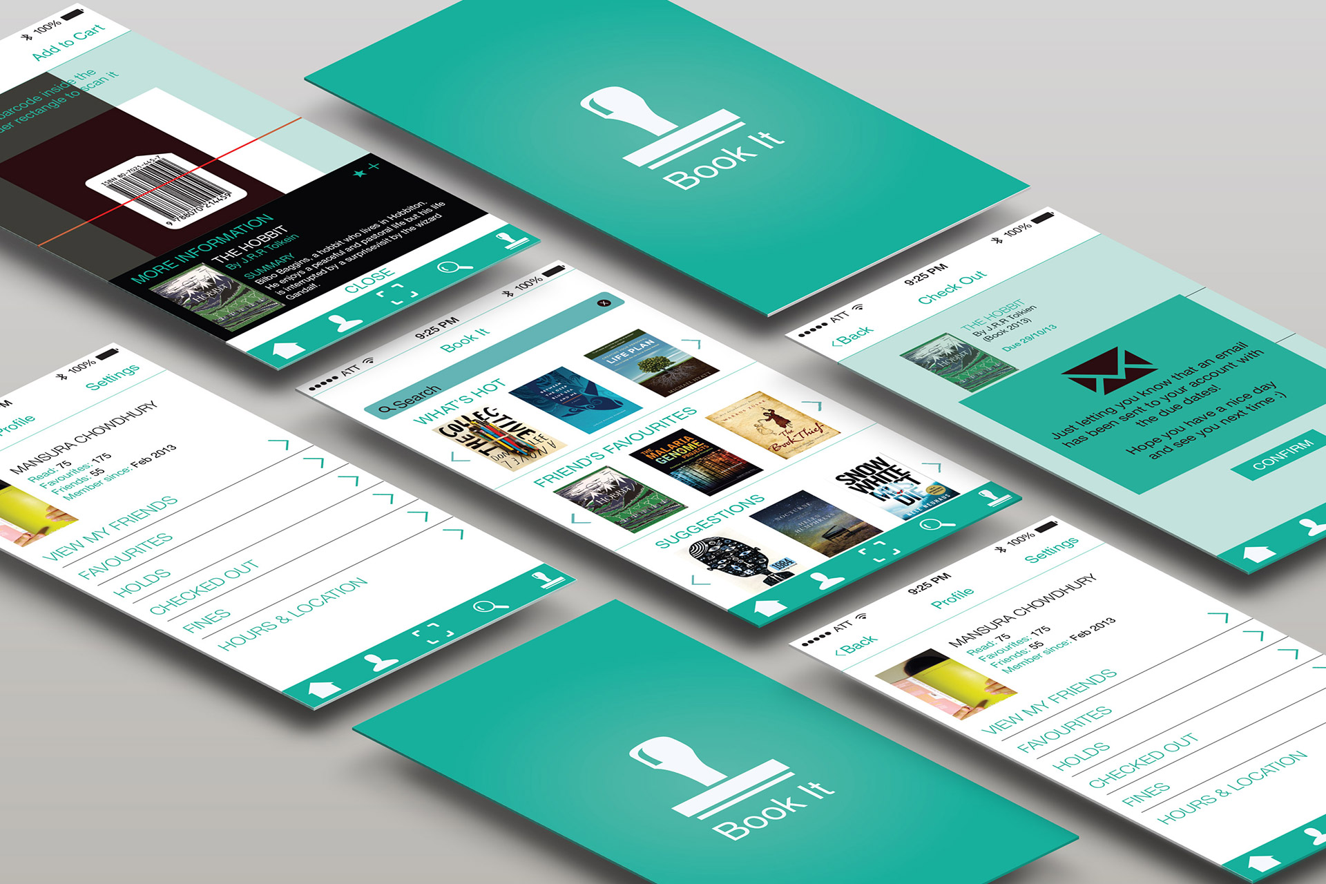
Book It is an app created for the Ottawa Public Library customers. The purpose of the app is to make the user experience easier and smoother for the customers. Our goal is to make the app as user friendly and eco-friendly as possible.
The app allows you to have an immediate and portable access to your account information, holds, fines, etc. Not only are you able to search the library catalogue on your device, you will also get suggestions based on the books you have read and favorited, as well as suggestions from books that your friends’ have read and favorited. There is a scanner function where you can scan a barcode of a book and get suggestions of books within the same genre or from the same author. You are also able to add multiple books in your cart and once you check out, the app will send you an email of the books that you have checked out with the due dates.
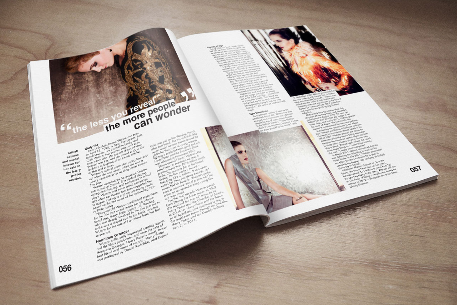
Emma Watson Magazine Spread
I find Emma Watson to be a great role model as an actress. She is a very smart, beautiful, and responsible women who has been active in the progression of gender equality, which is something I happen to believe in as well! This is why I have chosen her for my magazine spread. Please feel free to check out her gender equality organization called, He For She:
WebsitePet Circus
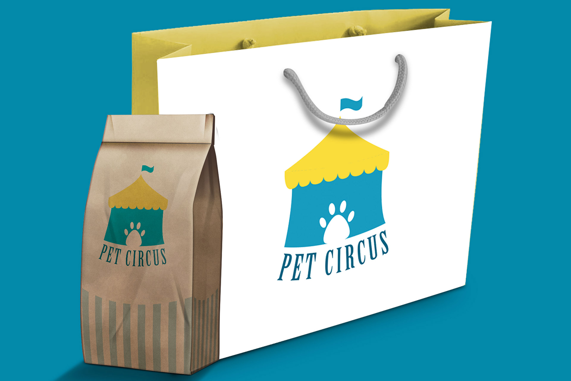
The goal of this project was to rebrand the company through creating a new logo and branding materials.
Artist Study
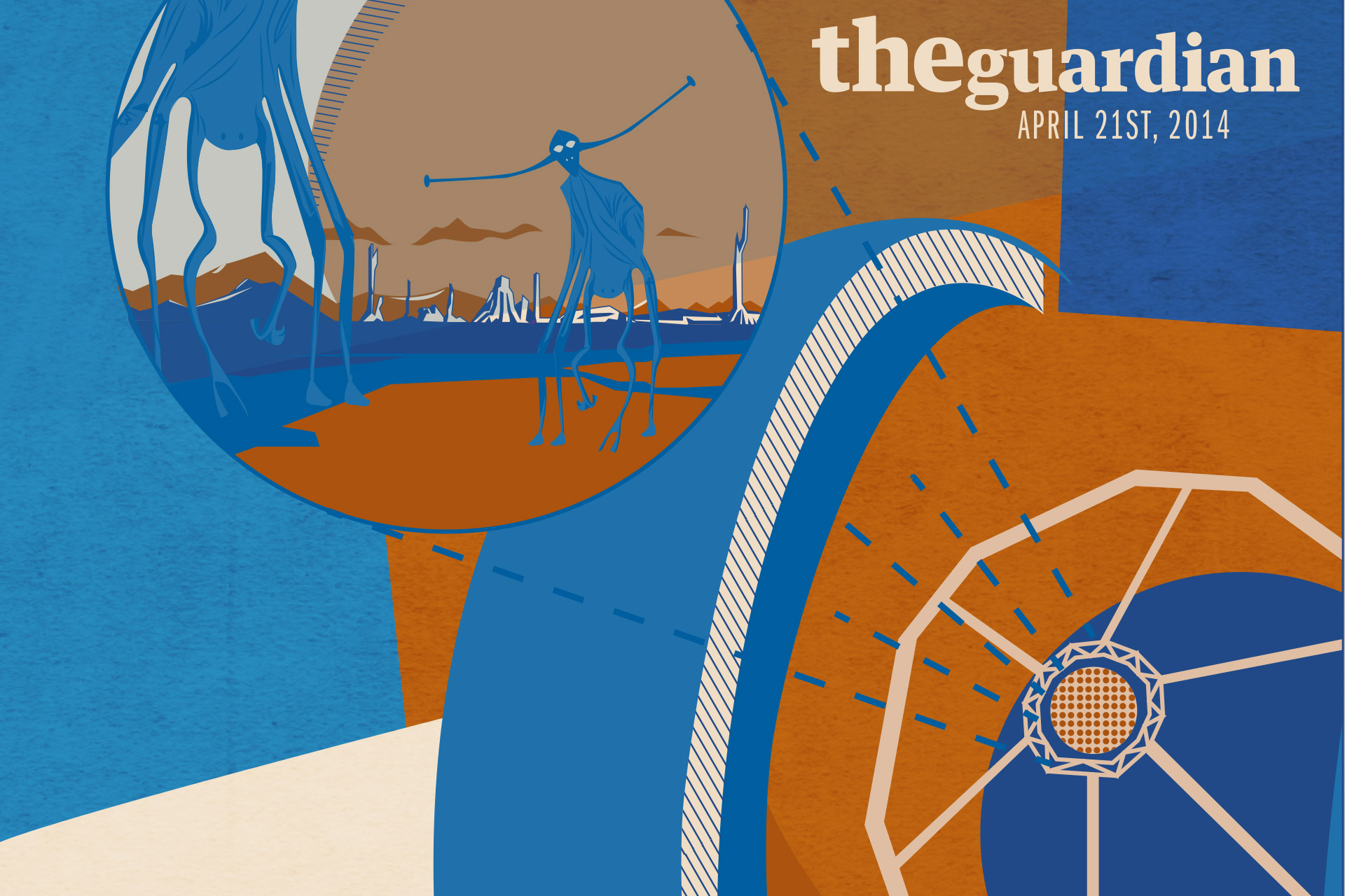
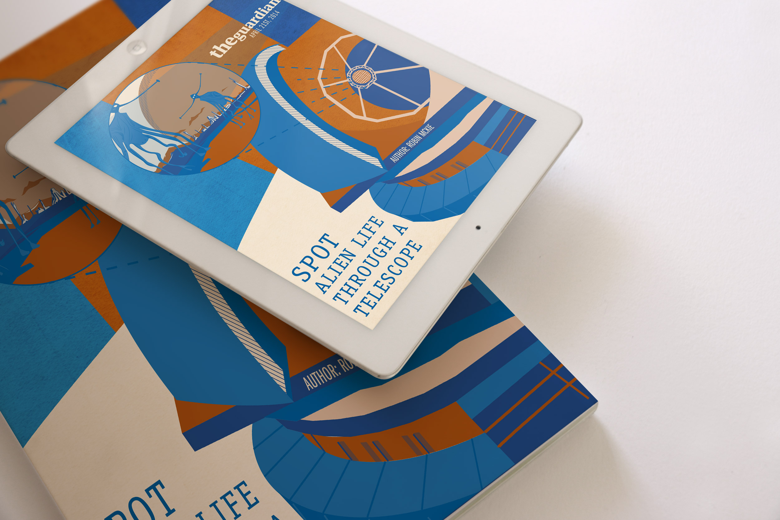
I created the image using Adobe Illustrator. I first created a good focal point and an interesting crop on my work. After I have placed everything where I wanted, I started to breakdown my illustrations in to simplified shapes. After I simplified the shapes, I started to add in line work to provide more details on some of my shapes, for example, the body of the “aliens” and the body of the telescope. I then started to add colors - my color palette for my illustration is blue and orange because I felt that the blue portrays the idea of science and space very well and not only does the orange provide a great contrast against the blue but also portrays a great atmosphere for an “alien planet”. I also made sure that the shades of color I have chosen are more darker because most of Jeffrey Pelo’s color palette are dark shades of different colors with added neutral colors to balance it out.
I used Jeffrey Pelo’s illustrations as my guide to follow his style. I made sure to use great curves and use gestalt patterns. All my shapes were strategically placed to flow seamlessly from one to the other and they were also specifically aligned. All of the shapes are in two dimensions but I have added an extra value to the shapes of the aliens to provide depth just like Jeffrey Pelo has done for the shapes of the animals and humans. The hands on the aliens are big but the feet are small. I have also added a grunge texture on my background shapes to provide that added depth and value, just as Jeffrey Pelo has in his work.
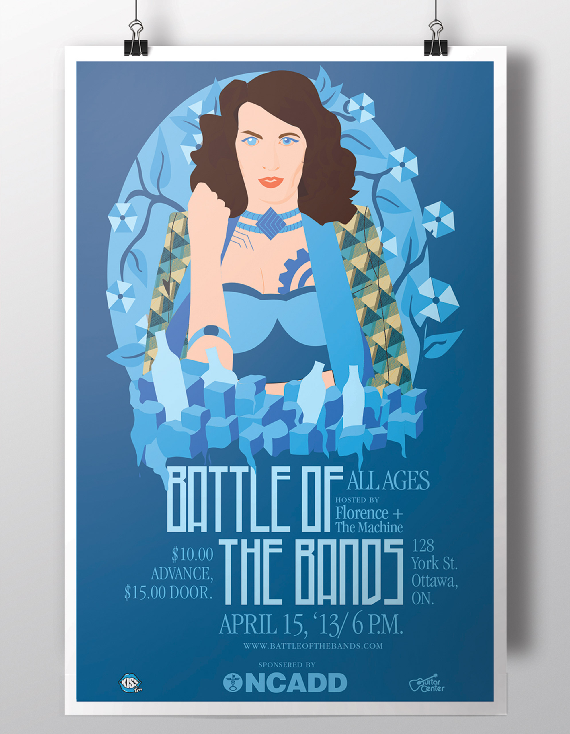
Battle of the Bands
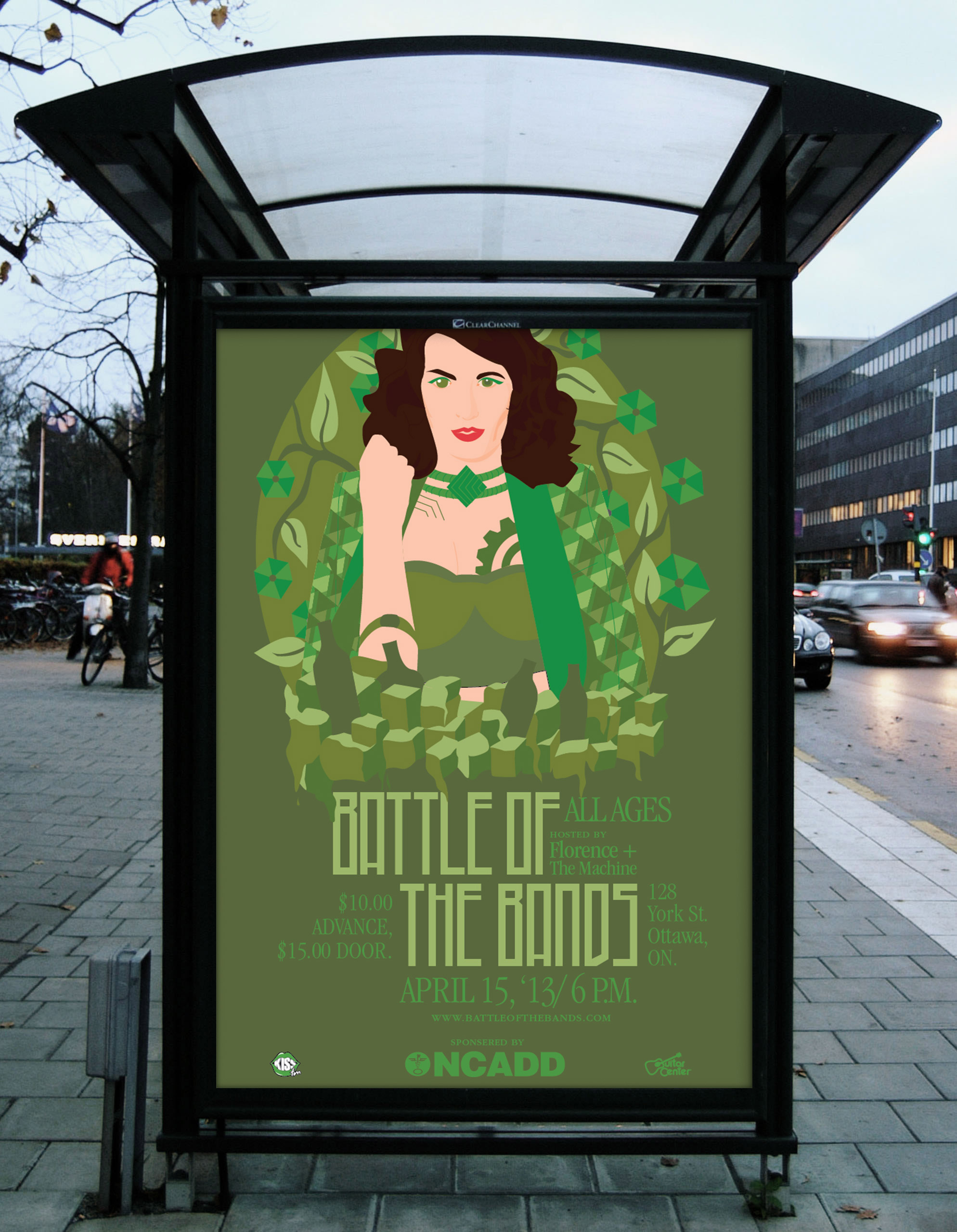
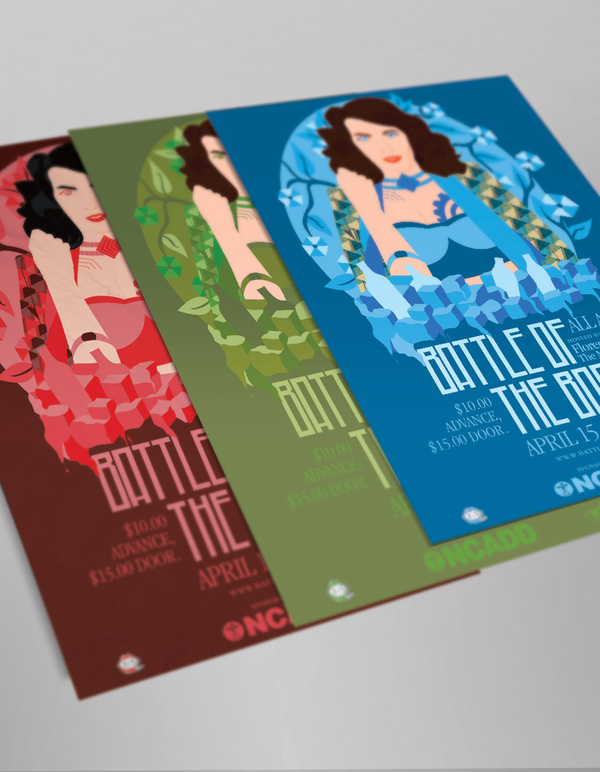
Created an event poster where musicians compete against each other! The event is hosted by Florence + The Machine - this is a fictious event; however, Battle of the Bands, really does exist. Please feel free to check their website below:
WebsiteRowan Atkins Applications
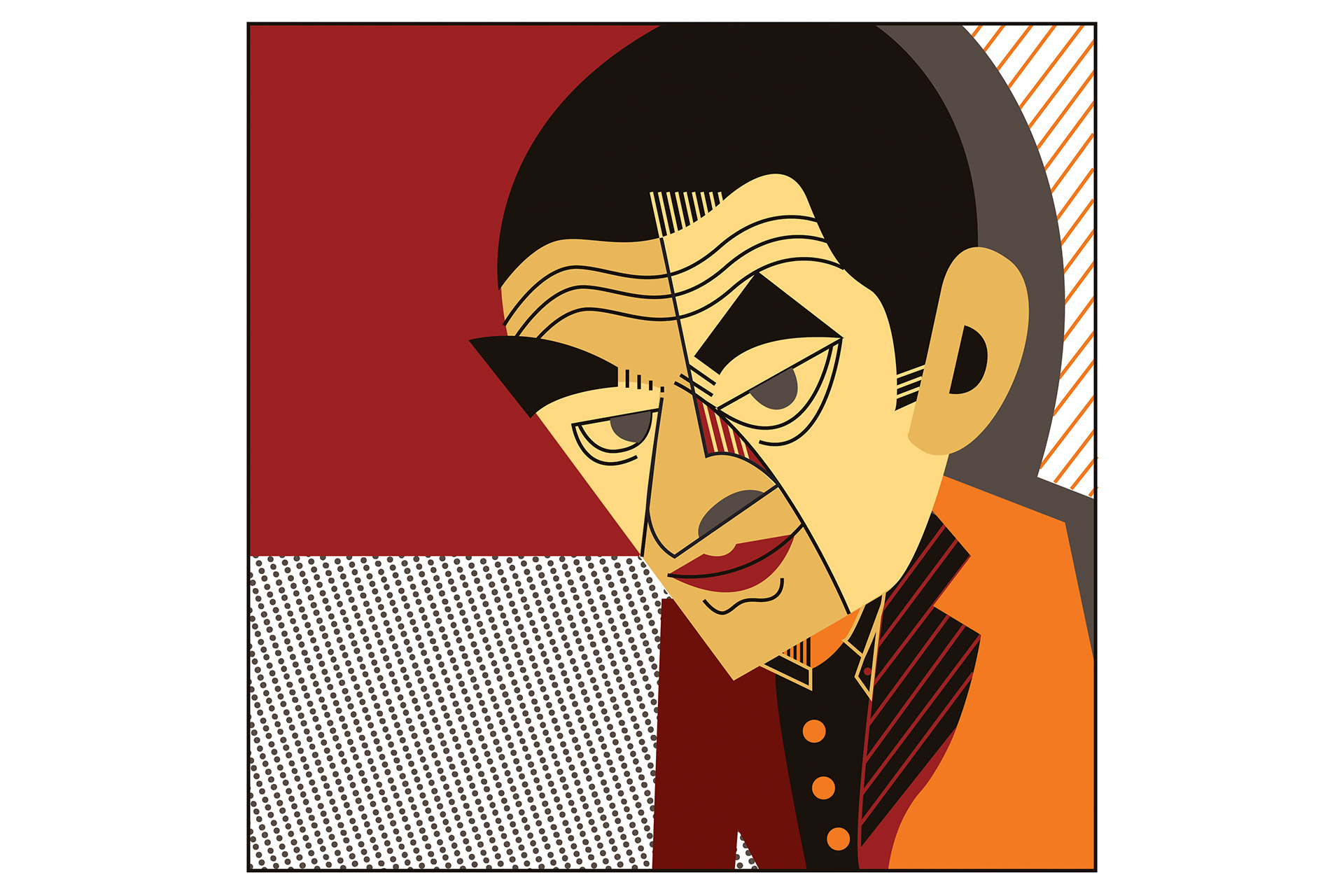
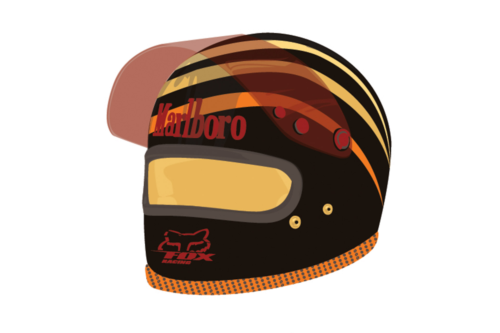
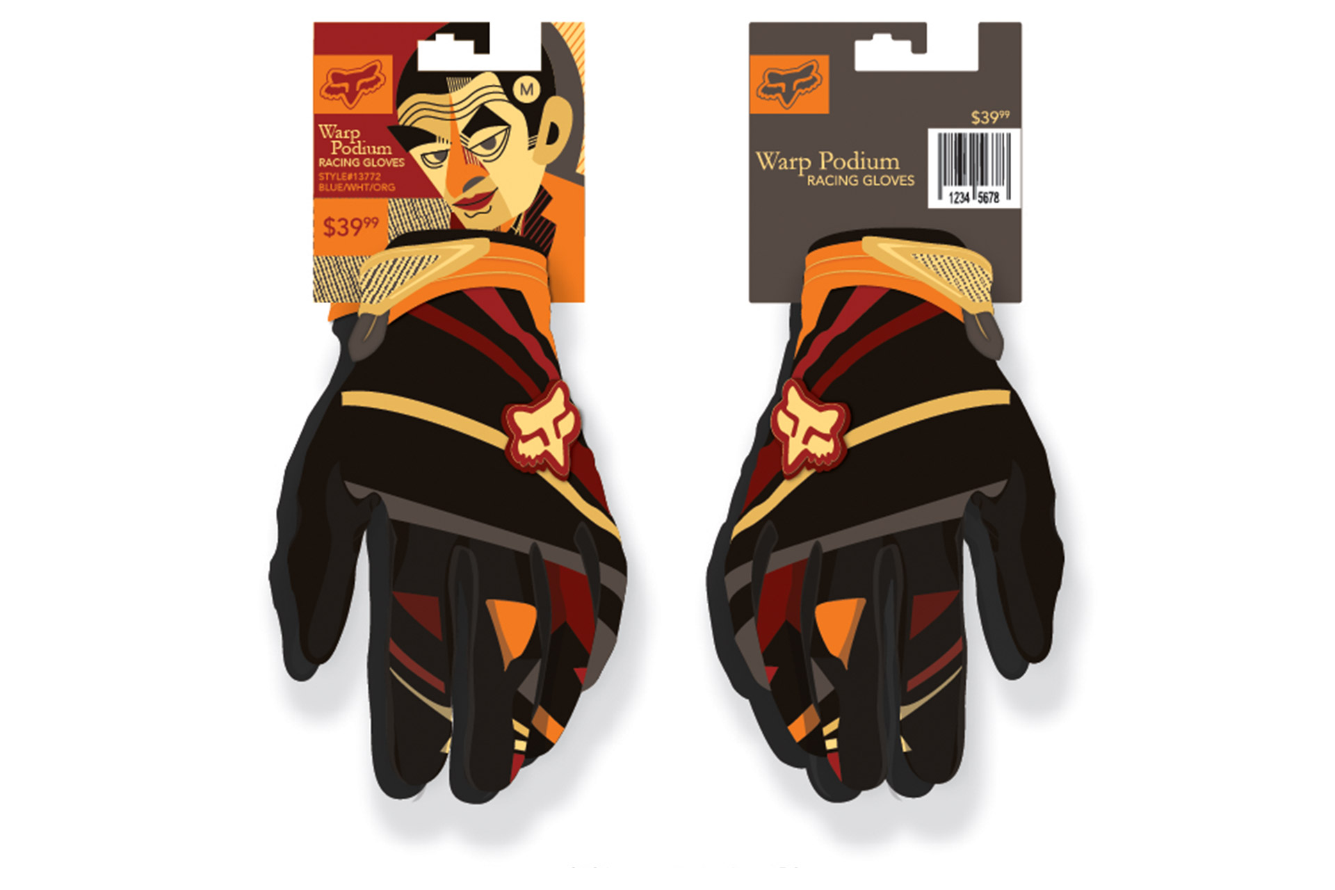
Created an art piece following the style of Pablo Lobato. Based on the artist study, we had to create applications that can be used. During my research, I found that Rowan Atkins loves motorcycles; therefore, using the illustration I have created, I designed motorcycle materials, such as gloves and helmet.
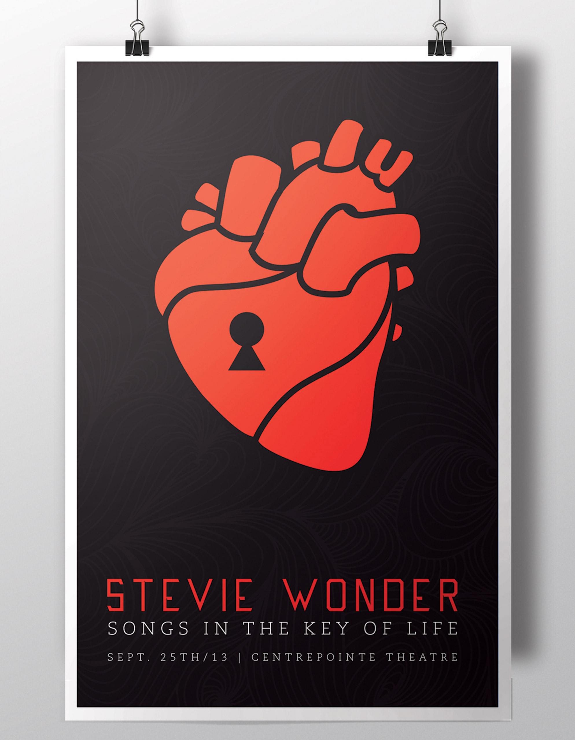
Stevie Wonder Poster
Created an event poster for one of Stevie Wonder's famous song, Songs in the Key of Life.
© 2016 EMDSGN.


